Archive for the 'Editions' Category
Tuesday, February 21st, 2012
Tomokazu Matsuyama Edition Release
Snow Globes by Tomokazu Matsuyama from The Standard Hotel on Vimeo.
This Thursday, The Standard Hotel Shop will release their latest artist edition, this time collaborating with Tomokazu Matsuyama. While no images of the product have surfaced yet (update – we were just sent the above video), we expect to see a snow-globe based on Matzu’s paintings. The release will be in an edition of only 30, so best grab one quick. Those in the NYC area should drop in for the launch event and after party.
Past collaborations have included products by Julia Chiang KAWS, Barbara Kruger, Ryan McGinness, Jose Parla, and Rostarr.


Friday, December 17th, 2010
Buy Art, Do Good :: Earth By Holiday Promo

Kelsey Brookes
EARTH BY, a side project of Planet Magazine, invites artists to create pieces based on their interpretation of Earth. Selling limited edition prints as well as the original work, the company donates 10% of all proceeds to Charity: Water, which provides safe and clean drinking water to thousands of people in developing nations, and 350.org, a non-profit dedicated to raising awareness about climate change.
Current available editions are by Alisson Schulnik, Kelsey Brookes, Chris Scarborough, Hisham Bharoocha, Cheryl Molnar, Ernesto Caivano, and Andy Gilmore. Past contributors included Chris Johanson, Peter Beard, Aurel Schmidt, Ryan McGinness, Wangechi Mutu, and others.
Use the code HOLIDAY2010 to receive a 10% discount on all prints and 5% on all originals through Dec. 25

Allison Schulnik
Saturday, December 11th, 2010
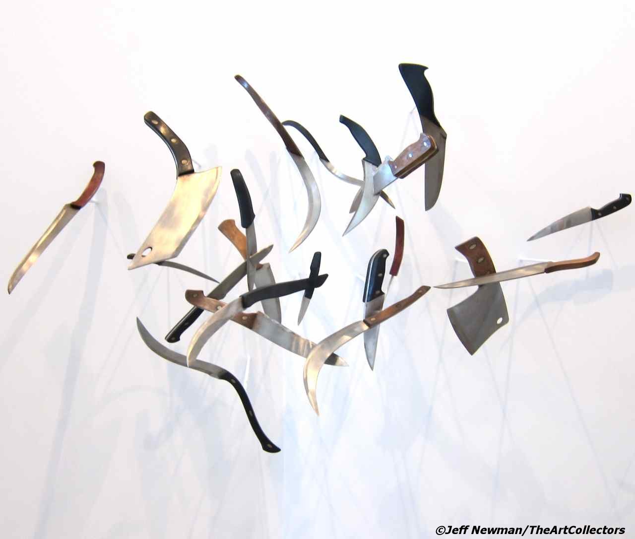
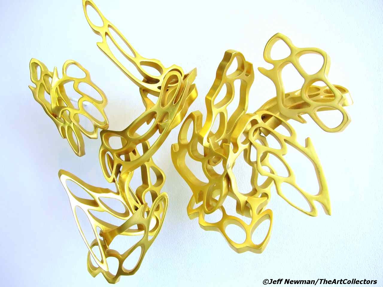
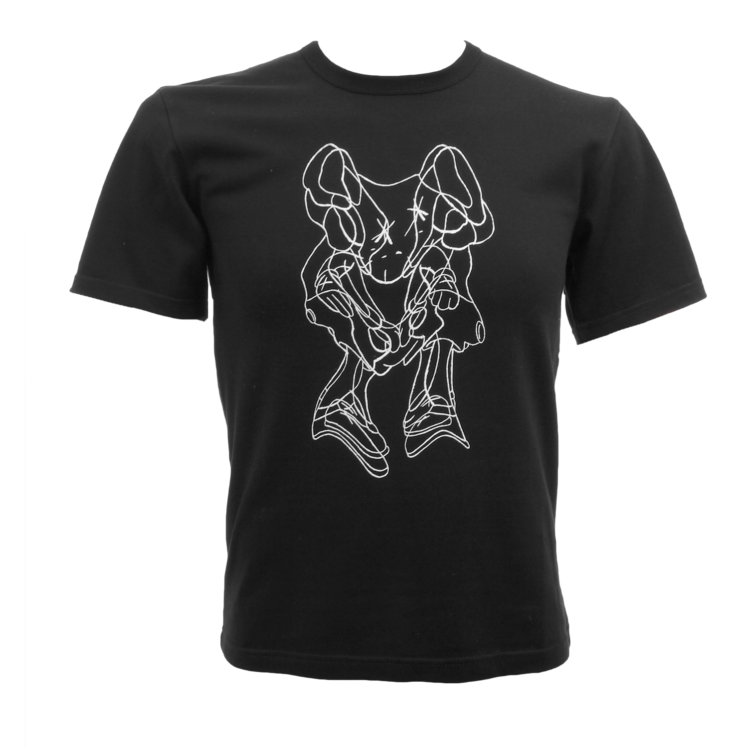
KAWS x Robert Lazzarini Companion Collaboration

(Product images via kawsone, Lazzarini artwork images © Jeff Newman/TheArtCollectors)
KAWS has just dropped a big one on us all. Next week the artist will release a new version of his Companion figure in collaboration with artist Robert Lazzarini. While KAWS is known for releasing products in several color versions, Lazzarini’s twist on the iconic character goes further, with each of the three renditions distorted in unique ways and manufactured from separste molds. Several t-shirts depicting Lazzarini’s concept illustrations for the project accompany the release.

Lazzarini’s renditions are an extension of his stunning sculptures, which brilliantly warp the perspective on common objects, including the artist’s recent weapons series that was the subject of a 2009 exhibition at the Aldrich Museum as well as recent gallery shows with Honor Fraser and FLAG Art Foundation (see our pics below) In 2004 his works were shown at The Virginia Museum of Fine Art, whose Curator of Modern and Contemporary Art, John B. Ravenal, noted, “Lazzarini’s sculptures are at once rigorously formal and intensely expressive. As distorted versions of familiar objects, they appear in the process of slipping- from three to two dimensions, from realism to abstraction, from this world to the next. Products of a dense and innovative process, his works seem both real and unreal: their striking immediacy is belied by a quality of ghostliness, as if they were hardly there at all.”
Lazzarini also has a recent editioned work produced via the Aldrich Museum available here.


Friday, November 5th, 2010
Get Your Gemeos & McGinness for a Penny

Iconoclast Editions has just released this Os Gemeos poster, available for just 1¢ plus shipping. The photo comes from a mural the twins’ painted this past summer in conjunction with the Viva La Revolucion exhibit at the Museum of Contemporary Art, San Diego. Also available for a penny is the below Ryan McGinness poster, released on the occasion of the commission of Art History Is Not Linear to the permanent collection of the Virginia Museum of Fine Arts.

Friday, November 5th, 2010
KAWS @ Emmanuel Perrotin, Paris / Spongebob Print Release

(All gallery images via Galerie Emmanuel Perrotin)
KAWS‘ Paris outing offers the opportunity to witness his latest fixation with large-scale sculpture. After the debut of the giant black Accomplice at the Aldrich Contemporary Art Museum, here we note the side-by-side accompaniment of a gargantuan pink Accomplice (both in an edition of 3, plus 1 Artist Proof). Aside from the massive dissected Companion at the artist’s Tokyo store Original Fake, Galerie Perrotin is the stage for an uber-scale brown 5 Years Later Companion (ed. 3 +1 AP). What truly marks this show is the ultimate evolution of brilliant colossal sculptural works, leaving the paintings in relative shadow. For the first time, KAWS has produced multiple immense sculptures for a solo gallery exhibition – an impressive offering indeed.
Together with the monumental 5YL Companion currently on display in Hong Kong, as well as the edition of life-size Chums, this exhibition clearly signals the direction KAWS is taking towards titanic renditions.
UPDATE: Just a few short hours before doors opened to the preview of the Editions|Artist’s Book Fair in New York last night, the Aldrich Museum announced the release of a new KAWS print at their booth. Priced at $800 the 20″x20″ edition of 100 depicts the artist’s rendition of the Spongebob character (image below) and is KAWS’ first print since his 2007 Dissected Companion edition. After the fair’s end, twenty remaining prints will become available via Art + Culture Editions.

KAWS – Kawsbob, 2010 print released by Aldrich Editions. (Image © Jeff Newman/TheArtCollectors)
KAWS, Pay the Debt to Nature
Galerie Emmanuel Perrotin
76 rue de turenne 75003, Paris
11/6/10-12/23/10


Wednesday, November 3rd, 2010
Shepard Fairey Pow(er) Print Release

Shepard Fairey is releasing the above print tomorrow, Nov. 4, in a signed and numbered edition of 450. The POW(ER) image was created initially created to accompany Carlo McCormick’s essay on the evolution of visual culture, appearing in Paper Magazine’s upcoming art issue, guest edited by Fairey. As the artist expalains, “the image is an homage to influential Pop Artist Roy Lichtenstein…I discovered an image he had made of a woman holding a can of spray paint or hairspray. The image looked familiar to me, because a few years ago I re-illustrated the same piece of clip art that Lichtenstein referenced for his spray paint/hair spray painting. The connection was was too serendipitous to ignore.” At $45 these are bound to go fast. Be on the lookout here.
Tuesday, October 5th, 2010
Peel Slowly and Read:: TAC Speaks with DB Burkeman about his new book

(All images © Rizzoli)
This week Rizzoli releases Stickers: Stuck Up Piece of Crap – From Punk Rock to Contemporary Art. The publication is a massive chronicling of the history of sticker culture, with more than 4,000 images and 30 contributing writers including Martha Cooper, Stanley Donwood, Shepard Fairey, Carlo McCormick, Clayton Patterson, Stephen Powers(ESPO) and Swoon. I got together with the book’s creator, my close friend DB Burkeman, to geek out about art, music, pop culture, and things to come.
JN: A lot of people know you from your pioneering contributions to Drum and Bass and involvement in the music world, but we first met down in Miami during Art Basel and hit it off geeking out over art together. I remember being excited to meet another musician who was finding himself more and more obsessed with contemporary art. When did you start paying attention to art. Was music your entry point?
DB: I was psyched to meet you too. You were my first real art geek friend! For me, music and visual art have always been totally connected. I even feel that they are really just different expressions of a similar process. As a nerdy kid I spent many hours lost in the gatefold sleeves of new albums by my favorite bands. It was as important to the ritual and enjoyment process as listening to the record. I think I actually wanted to be an artist, before I wanted to be a DJ, but not being able to draw for shit kind of hindered that option. I wanted to be a rock star too, but couldn’t play an instrument well either. So I went for taking pictures of rock stars instead. Then I heard a DJ that gave me an epiphany. When I was putting out mix-tapes and mix CD’s I always paid super attention to how they looked. I’m always shocked when someone puts out a great record that looks like poo. I really hated the creation and take over of the CD format. That real estate of the twelve-inch was reduced to a measly five-inch cover with nasty plastic. As for MP3’s, yeah, great for mobility, but no visual presence at all. I’m sure you and your readers are aware of the massive revival of vinyl. I was talking to someone from ADA (Alternative Distribution Alliance) last week and he said that pretty much every indie band releases their albums in a vinyl format now.
JN: Music was the catalyst for me too. High school was the first time I can recall wanting to find out about who the certain artists were behind art. I needed to know everything about a record – from the studio it was recorded in and who was at the mixing board, to who was behind the imagery. I really love the section in your book with old SST Records stickers from bands like Black Flag, Meat Puppets and Husker Du. Indie labels like that were definitely the first art I paid attention to. Sonic Youth was another big one for me. The records they did with artists like Raymond Pettibon, Richard Kern and Mike Mills became the first artists I started to follow and look in to.

DB: Well, I’m older than you. I wanted to know about who did Led Zep covers and go work for them. I actually applied for a job too. Hypgnosis wrote back and said I needed a university degree. Then I discovered Punk Rock. I think I forgot to tell you, but hanging out with you was what gave me the idea and then inspiration to try to get Sonic Youth in the book.
JN: No, You never told me that. That’s awesome! They recently put out a book and did an exhibition chronicling all their collaborations with visual artists.
DB: Do you know about Vinyl Factory in London? Its a art based record company that makes limited editions of big name artist records. You should see the Massive Attack one they produced – incredible!
JN: I think maybe we were looking at that shopping for records at Kim’s and started taking about the Designers Republic stuff too. Can you talk about the genesis of the book? I think when I met you two years ago it was in your head and you had already started contacting contributors.
DB: It started just over 3 years ago, simply as me trying to gather together all the stickers I’d collected from punk and then skate and street brands into a scrap book. A friend actually suggested that it might make an interesting book as a history of stickers. I did a bit of research and found there were loads of sticker books in the market, mostly graf and street art ones, but nothing that came at the subject from a historic, timeline perspective.
JN: One of the things that interested me about this book is that even though it’s represented, this is not really about graffiti, but functions more as visual history of how stickers have existed and evolved over time within different segments of the pop culture landscape, including music, fashion, the street.
DB: I think the graf and street art angle was why the publishers were all hungry for it, but its definitely not a graffiti book. Anyway, by the time I’d met you I was in way over my head. I had collected thousands of stickers and people from all walks of life offering more, but I had no publisher no designer to actually turn it into a book. I ended up meeting the designer Monica LoCascio via Gary Pini and together we created a few mock pages to send to publishers.

JN: Was it hard approaching potential contributors, especially some of the more notable ones without having a publisher? I imagine some bigger entities or names may have only want to be involved if there was a well known publisher and good distro on the table, and have shied away from doing something smaller or more DIY. How did you tackle that and not come off like, “Hey, I’m making this really great book and I don’t have a publisher and can’t tell you who will put it out, but you should be in it anyway!”
DB: Some people were amazing, I think Radiohead’s visual artist and designer Stanley Donwood wrote back and said he was down to contribute text before I had Rizzoli on board. ESPO and Banksy too. It really took off once I had a prestigious publisher’s name though.
JN: How did Rizzoli get involved?
DB: It sounds crazy, but I simply found the name of an editor. Actually Ryan McGinness kindly gave it to me and I pitched the idea of the book to them. Turned out my now editor at Rizzoli actually had a tag sticker of her own and the book idea instantly connected with her on a personal level. It’s really nuts, because out of the five top publishers I wrote to, four of them came back and made offers.

JN: I’m sure having so much of the leg-work done with contributors already on board, content sorted and legally cleared helped seal the a deal.
DB: I think it helped for sure. The main challenge for me was keeping track of who had given what to me and making sure they were credited. I think my favorite two pages in the book are 289 and 299. They have no stickers them, just a list of 1300 credits! We worked for three months on those two pages. I actually have real nightmares about people coming after me pissed off that I spelled their name wrong or missed the page they are on. There are still hundreds of stickers that are not credited yet. We have a email address, whomadethatsticker@gmail.com, for people to write to so the next printing of the book can be updated.

JN: So you still don’t know who the artists are behind some of the images, but what about the stuff you did know? Was getting the rights to anything a hassle or cause any roadblocks? I know there was that headache with Live Nation and Sex Pistol, right?
DB: Most the real problems with permissions were from companies that owned the rights, not the original artists. The Pistols held a very special place in my heart. I came of age at the exact moment of their creative output. Sadly my feelings have considerably changed towards them. I spent a frustrating year and three months trying to get permission to simply show a few of their stickers. Live Nation owns their rights now. They wanted to know how much I would pay. I really wanted to put together a page that said “Sex Pistols stickers: permission denied by Live Nation,” but Rizzoli shot that down since they are working on the idea of a Pistols’ book. Eventually they were able to clear it for me but only with the stipulation that Jamie Reid was not credited as the artist. Nice people Live Nation are, huh? Since then I’ve noticed a massive flood of Jamie Reid’s images on all manner of cheesy products.
JN: Yea, Live Nation are behind the recent PiL reunion too. Lydon’s in deep! So, looking back, where do you see the earliest seeds of a sticker culture?
DB: It’s really hard to define where and when the culture started. The first sort of craze in America was called Decal-Mania, but travelers in the 1920s would put country or city stickers on their luggage trunks to show off where they had been. Clayton Paterson’s partner, Elsa Rensaa told me this great story about how in the French Revolution the streets of Paris had wheatpastes of Mary Antoinette being fucked by pigs. Rizzoli are such sticklers for fact checking, so I couldn’t include it in my introduction since we could not find exact documentation of it. Carlo McCormick wrote an incredible academic history piece for the one of the three introductory essays in the book.

JN: One of the most interesting aspects of street sticker culture is the riffing and remixing of designs. A well known example is how many people out there have taken Shepard Fairey’s early Andre Has a Posse sticker. And he himself, along with countless others – the Supreme logo for example – have used Barbara Kruger’s red and white block lettering style. You’ve also been a part of this. You’ve referenced both Kruger and Fairey in some of your own stickers. What would you say to those who see this as nothing more than lazy design theft?
DB: Interesting question. I never thought of it as theft. The thing I love most about stickers it is how they show that a simple graphic or design can get into the sub-conscience of society and become part of the visual zeitgeist for the next ten or twenty years. I’ve been a fan of “culture jamming” since I first discovered it in the early 80s via Rick Klotz and his streetwear brand Fresh Jive. Stussy also flipped Channel’s logo with the double S’s instead of C’s. As a club and rave promoter in the early 90s I did my own logo jamming stickers, very influenced by Klotz. But really, it all comes back to the Pop artists of the 60’s like Warhol and Rosenquest with products.
JN: Yeah I don’t look at it that way either – to me its probably the most compelling thing about the culture. There is an ongoing dialogue and acceptable language of appropriation that keeps evolving. What about people who search the streets, remove and collect them. Martha Cooper, for example, recently published her second book of stickers from her personal collection. I know there has been some criticism against people who remove them from their intended home on the street. Where do you weigh in on the debate?
DB: Martha’s essay in our book is titled “Confessions of a sticker thief. ” Call me nieve, but I never considered it stealing. I think of it as collecting them to show them to a wider audience. If I didn’t take it to preserve it, someone else would, or it would get buffed off by the city, or the weather would destroy it. So far no artist has contacted us and said they don’t want to be in the book or in the gallery shows we’re working on. Plus we are offering to give back any of the stickers to the artists that did not donate them. It’s the same email as I mentioned before, whomadethatsticker@gmail.com.

JN: Sounds like you’ve been pretty supported by the community. Any haters?
DB: Only one hater so far. Generally people seem to be going nuts & saying stuff like “It’s the fucking bible of Stickers!” Monica and I worked so hard on this and it’s so amazing to finally see the 30 writing contributors and the 1300 artists that we know of be impressed and pleased. So far the biggest kick I’ve gotten was sitting at Tony Goldman’s desk watching him spend 30 minutes scanning the book and finally saying, “this is an important contribution to art.” Monica and I were walking around in a pink cloud for the rest of the day. Till the next crisis came up.
JN: Nice! He’s gotten fairly involved in in supporting street art. There was the Deitch sponsored Wynwood Walls project he provided space for during Basel Miami and he’s been lending the Houston Street wall in New York out for a couple of years now. Actually, I think every artist that has been on that wall is represented in Stuck Up – Haring, Os Gemeos, Shepard, and now McGee, right?
DB: Sadly I could not get Os Gemeos stickers in time for book, but they will be in the exhibition. I don’t want to say too much about why we were talking to Mr. Goldman for fear of jinxing it, but watch this space!

JN: Got it! So what’s up with the exhibition?
DB: We’re working on finding the right partner and sponsor to help us turn the book into a museum quality exhibition. Not just a bunch of stickers on the walls, but a massive project. The plan is to do New York in March, Chicago in July, L.A. in September, and Miami for Basil in December 2011. Lots of really exciting stuff in the works, but I need to get some sleep first….
Stickers: From Punk Rock to Contemporary Art is out now via Rizzoli in paperback or as a limited, numbered hardcover deluxe boxed edition, including a folder pack of 23 exclusive die-cut stickers, many signed by the artists. Contributors include Kenny Scharf, Barry McGee, Ryan McGinness, Jose Parla, Mark Dean Veca, Rostarr, and Space Invader.
DB can be heard on his eclectic by-weekly mix-tape style radio show, BLURRINGradio at http://urls.artonair.org/blurringradio (shows are achieved down the page).
(All text © Jeff Newman)
Thursday, July 1st, 2010
New William Wegman Print Set

20 x 200 has just released a new pair of prints by William Wegman, available together as a set. Pink Elephants depicts one of Wegman’s signature silly dog photographs, which, as he puts it, “is a little like one of my drawings in its directness and simplicity, a sort of pictorial equation: grey dog plus sock equals elephant.” It is a is coupled with a reproduction of a quick drawing called No Fun Sleeping Under A Picture Like This. As always with the print house, editions are available in a number of sizes and price points, ranging from $100 to $2000. You can get them here.

Wednesday, June 16th, 2010
Roger Ballen Print Release

(Image © Roger Ballen via 20×200)
Today’s 20×200 print release comes from famed photographer, Roger Ballen. Ballen is represented by Gagosian Gallery and his work resides in museum collections around the world, including the Pompidou (Paris) The Tate (London), and Museum of Modern Art (New York). The release includes multiple sizes and price points as follows: 10″x8″ ed. of 500 ($50), 14″x11″ ed. of 250 ($100), 20″x16″ ed. of 50 ($500), and 30″x24″ ed. of 25 ($1000).
Get it here
Monday, June 14th, 2010
New FAILE Print on Sale / Portugal Project Revealed

Faile’s studio during preparations for their 2008 exhibit, Lost in Glimmering Shadows. (Image via Faile)
A few short weeks after closing the doors to their Deluxx Fluxx Arcade, more news comes in from the FAILE camp. A new print goes on sale tomorrow, June 15 at 12pm EST via PaperMonster. Titled Ecstasy, the silkscreen will be one of the final releases from the Lost in Glimmering Shadows series, based on imagery from FAILE’s 2008 show in London. Keeping true to form, the 12 color signed, stamped and numbered edition of 175 was screened and painted in-house, and measures 25″ x 38″
FAILE have also announced more details on their upcoming contribution to Portugal Arte 10. From July 16 to 15 August 15, the Brooklyn-based artists will display Temple, a full-scale church in ruins, set in Praça dos Restauradores Square in Lisbon.
UPDATE: Here’s the print, released for $775 and sold out as of 6/15. Note that colors vary due to hand painted elements.
